9/6/2022
Create your startup
6 minutes of reading
This is what the first landing pages of 10 successful companies were like
Authors
- Santander X Explorer
Categories

We all have a past, and Facebook or Instagram are no exception. What were their first landing pages like? Keep reading…
Facebook, Amazon, Uber, Spotify. We all have a past, and established businesses are no exception. Before they took off, they launched their services by advertising them in the best way they could think of. What were their first landing pages like? Keep reading…
We already know what a landing page needs to be considered effective (i.e. to attract customers). It must have a great headline, information (but only what’s strictly necessary; remember distractions are not advisable on these pages), make the benefit clear and offer a perfectly visible call to action. Today, most successful companies follow these commandments on their websites. But was this also the case in the beginning? Take a look at these ten examples and decide for yourself…
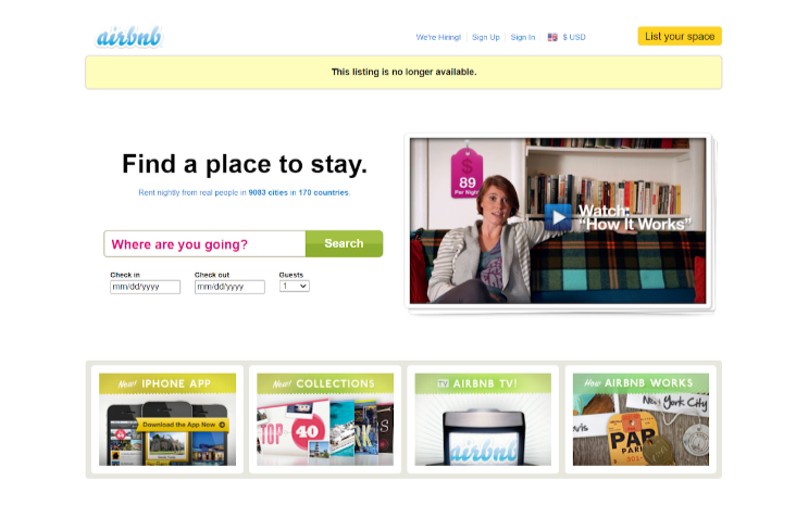
Airbnb
In addition to changing the logo, the company decided to simplify its landing page as much as possible. Zero concessions to users’ entertainment; down to the nitty-gritty.
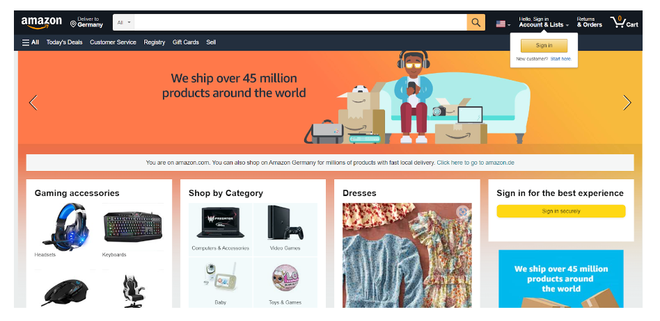
Amazon
The mishmash of elements that good old Jeff Bezos had on his site during the beginnings of Amazon made sense for websites… in the early 2000’s. It’s not that there are much fewer components now, of course, as the landing page is still brimming. But you can clearly find where you need to go depending on what you want to do.
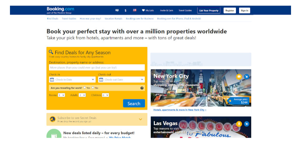
Booking
Alright, a list of random destinations so you don’t run out of options to choose from; that’s how things were in the early days of Booking. Fortunately, minimalism has taken over their landing page.
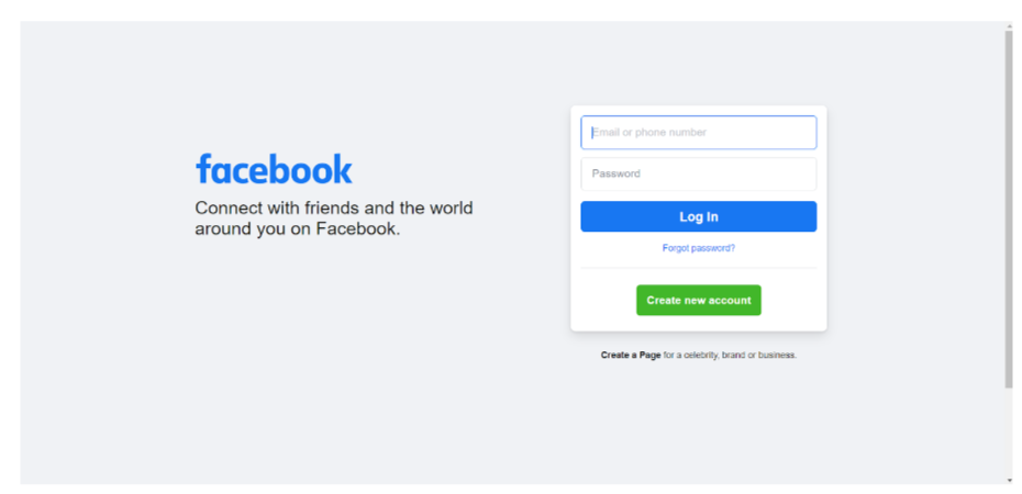
Speaking of simplicity… here’s Facebook, which when it was a social network for universities provided some explanations on its home page (no need now). And they certainly didn’t get carried away with frills in terms of design. Zuckerberg was always clear about this.
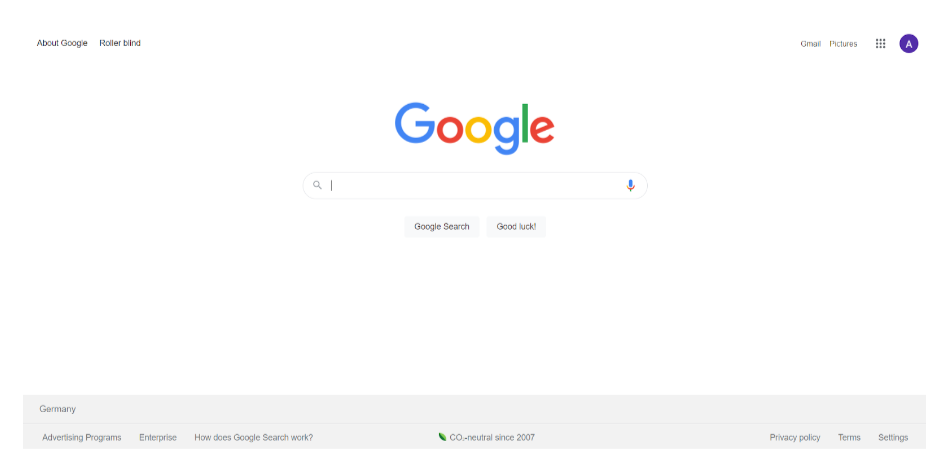
Indeed, Google also has its history, although it seems as though the years have hardly passed for its landing page. Look at this beta version, practically identical to the current version, except for the font and the exclamation mark. Maybe they thought it was too distracting…
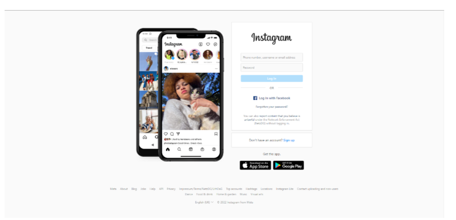
At first, they thought there was a need to clarify what their social network proposal consisted of and included it on their landing page. Now, it’s the perfect example of what to do.
Skyscanner
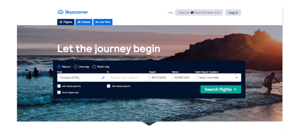
Hands up if you’ve never used this search engine to plan your vacations. It’s simple, clear, clean… But in 2003 it wasn’t. On top of having different tabs with several views (monthly, weekly or daily), wherever you looked the amount of links there were made it anything but user friendly…
Spotify
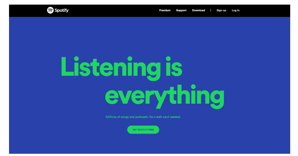
You’re familiar with this structure, aren’t you? Exactly, it’s perfectly comparable to what we‘ve seen with Facebook and Instagram: a landing page that at first included a bit of information in small font… They had to explain what the service consisted of since it was completely new! Almost 15 years later, it’s so well known that its premium version is offered right on its home page. Getting right down to business.
Uber
Uber’s first site dates back to just before 2010; here is their 2011 landing page. We know, we know; our eyes hurt too. But don’t be blinded by the font and the car because you’re looking at a page that has almost all the elements we would describe as right. Fortunately, they’ve refined it without losing their essence.

Zappos
Amazon and Zappos both had a first landing page loaded with information, links, hardly any design… and they simplified it, fortunately for users.
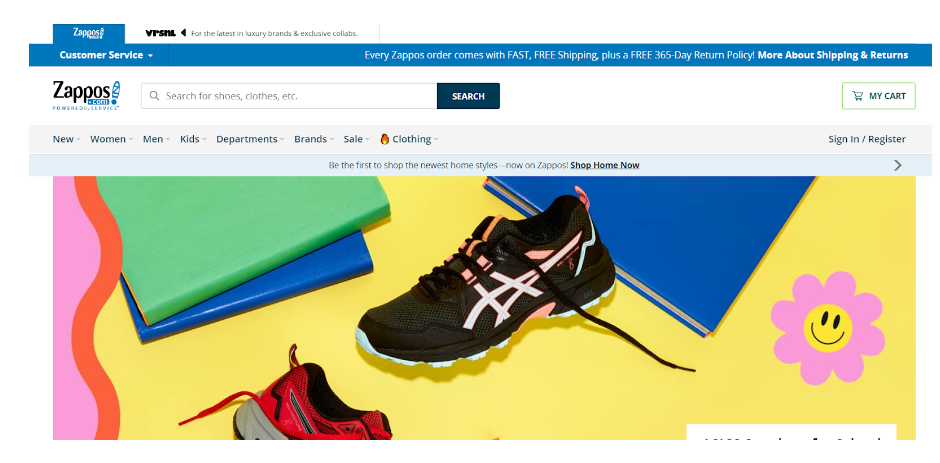
Photo by KOBU Agency on Unsplash.


